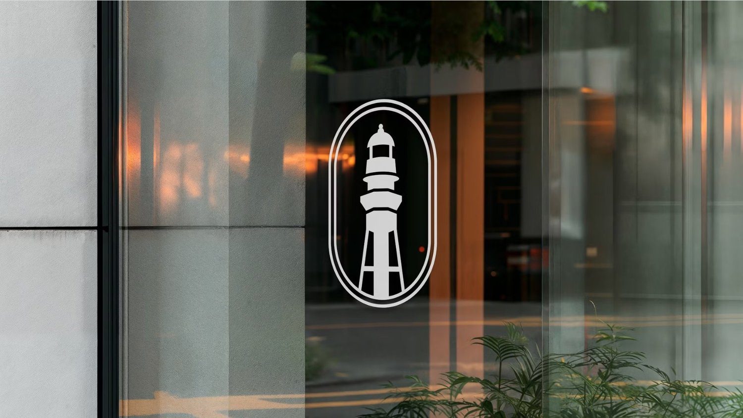
Moat
Moat is a biometric smart lock company.
- Brand Strategy
- Naming
- Logo
- Typography
- Copy
- Color Palette
- Website
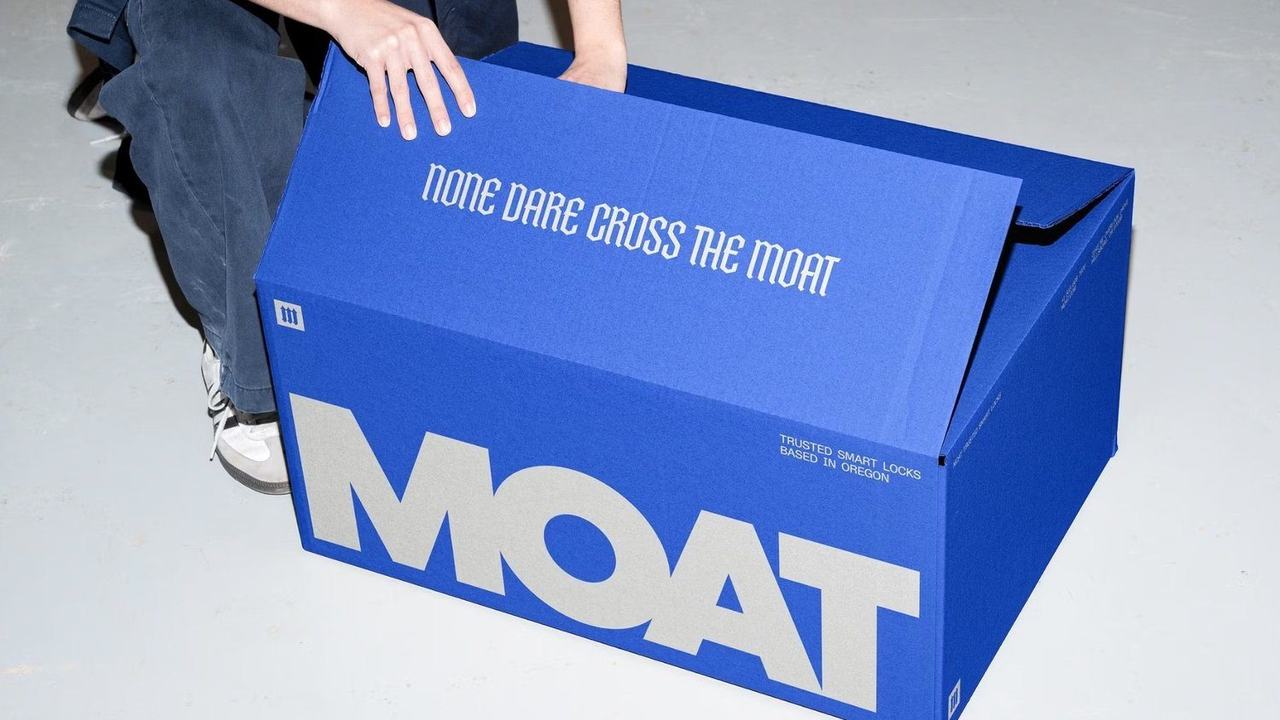
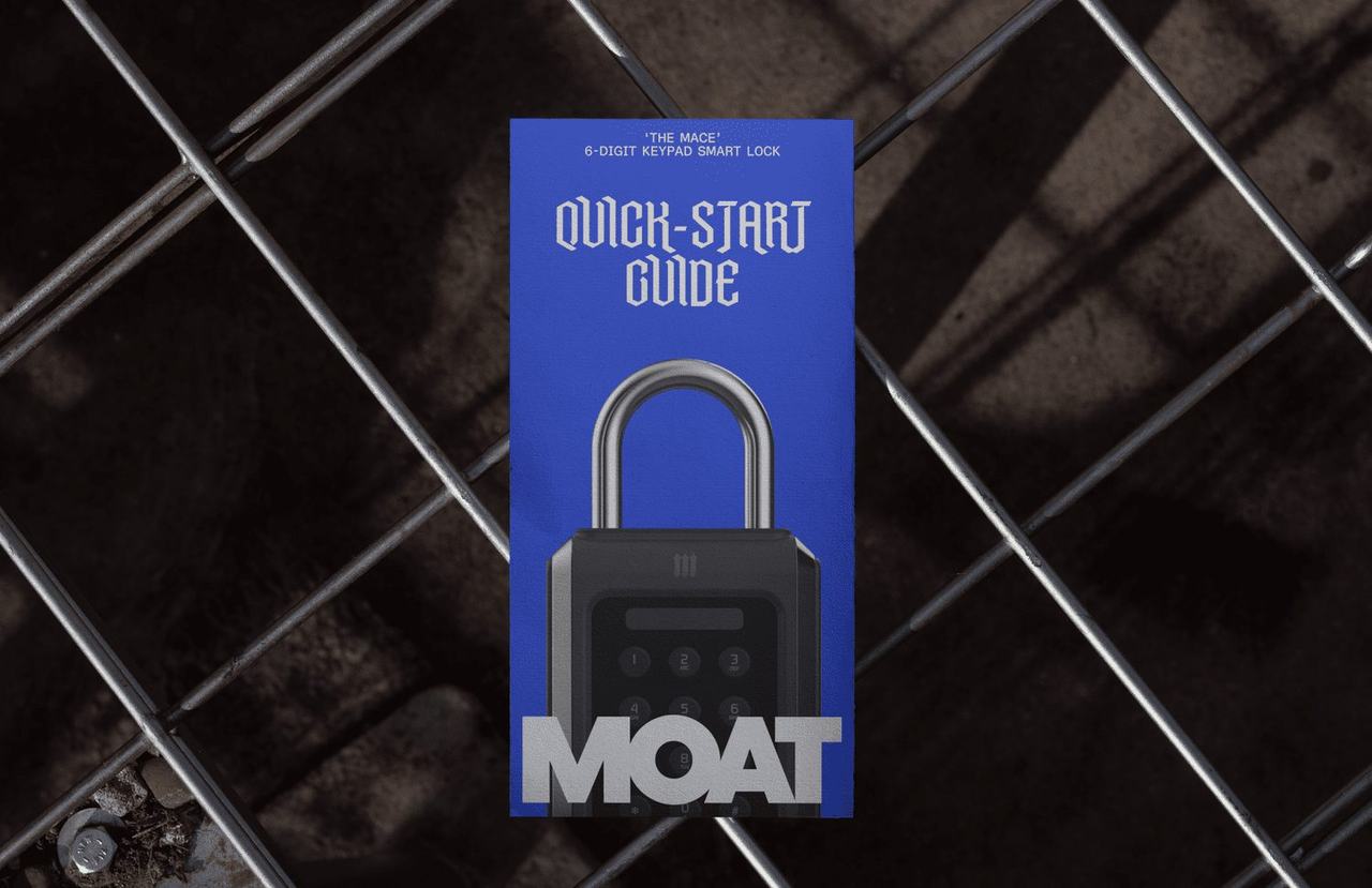
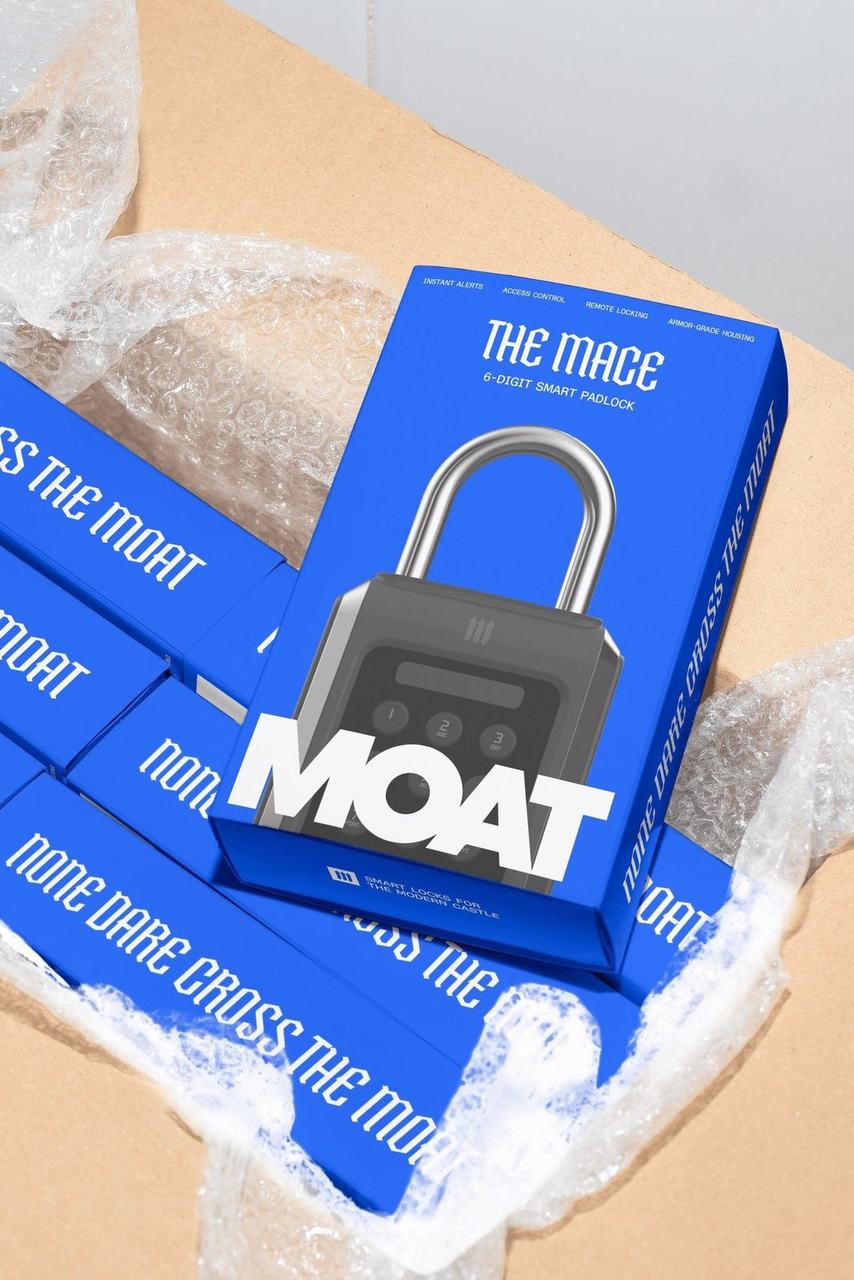
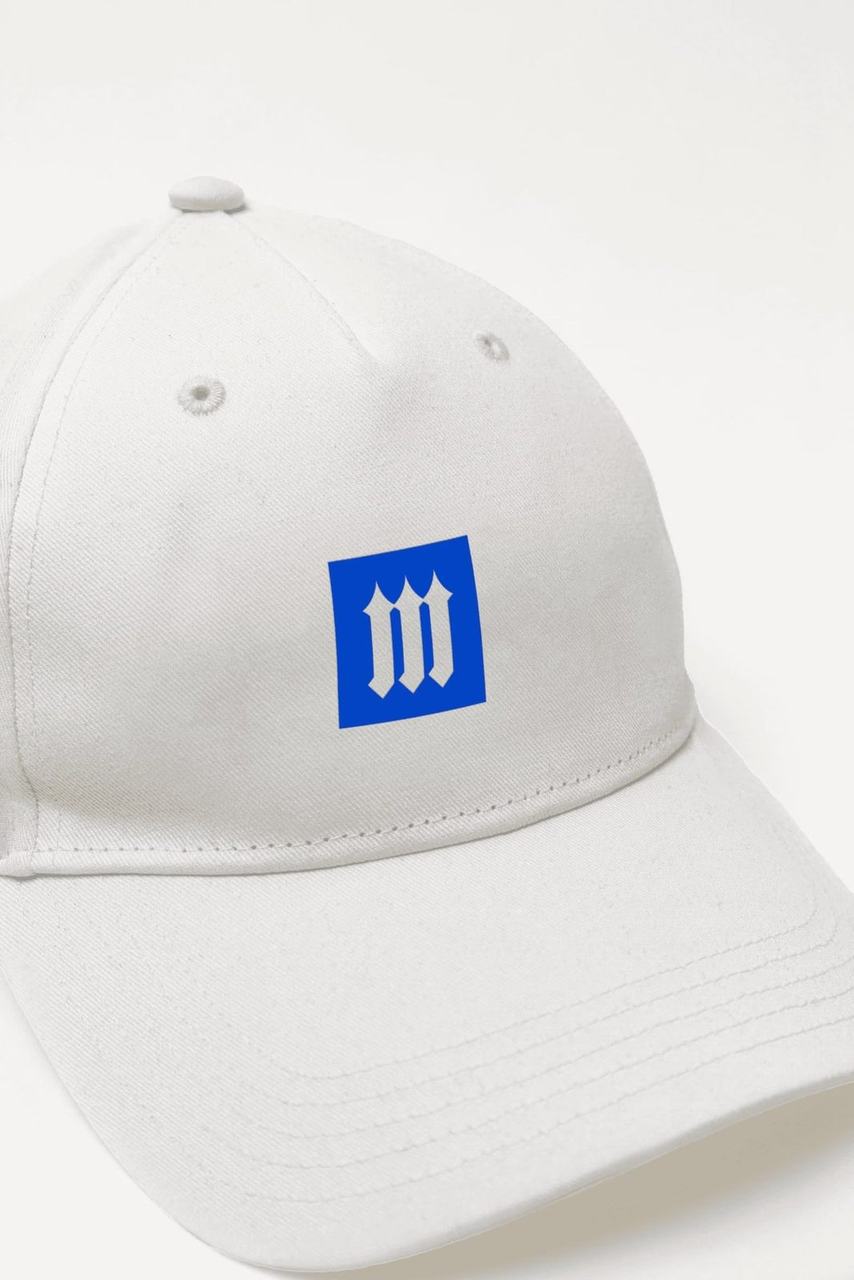
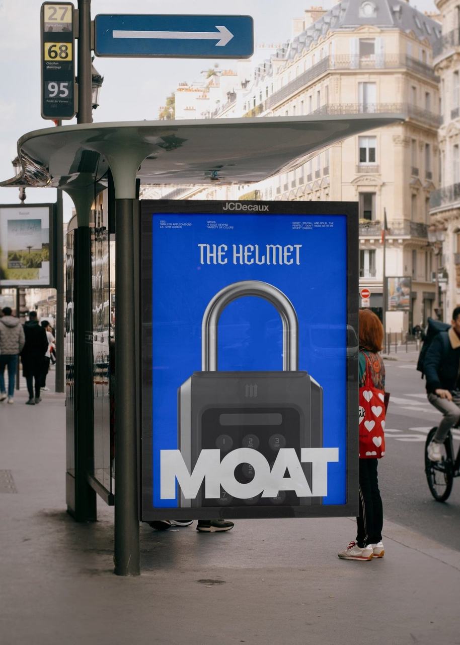
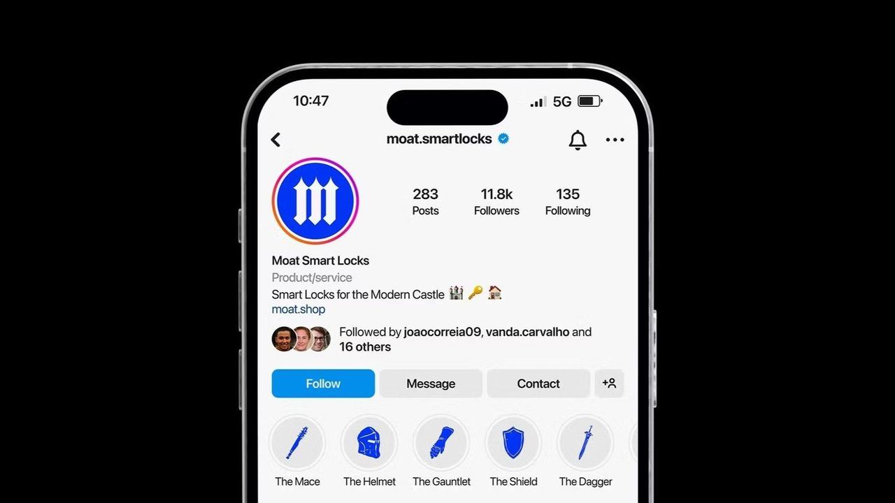
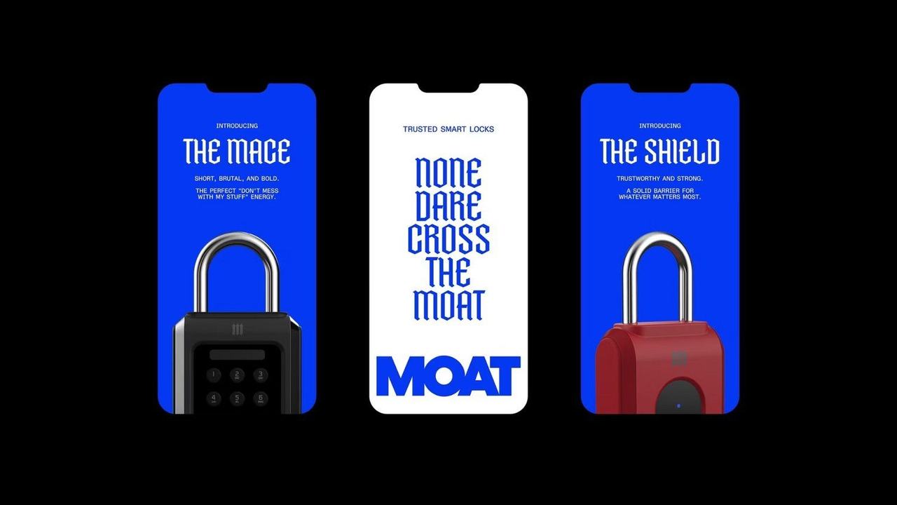
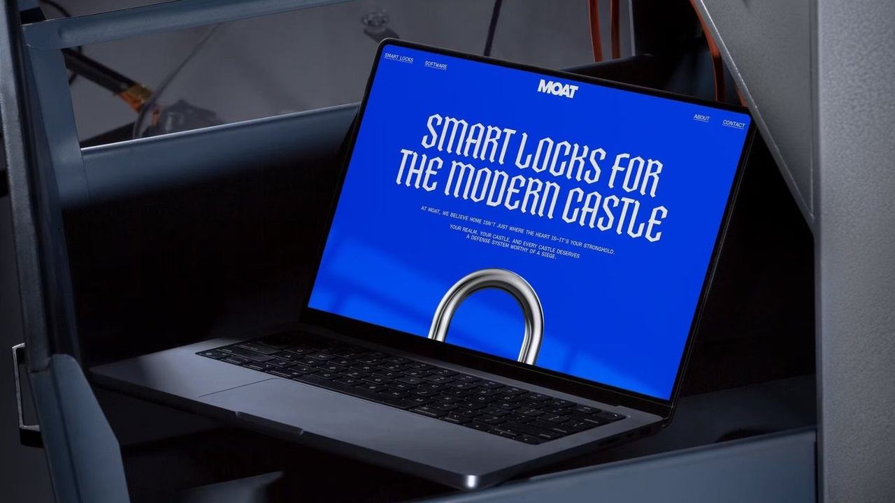
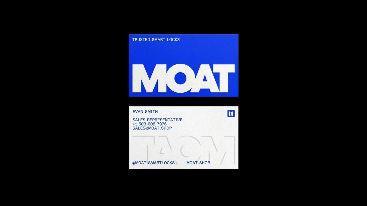
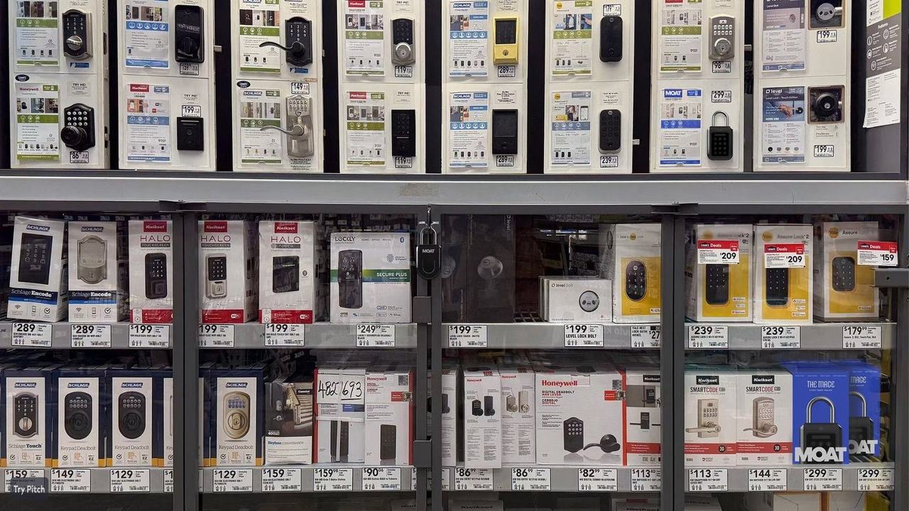
Moat is a biometric smart lock company. The first product was a fingerprint lock for gym lockers, with schools and large facilities next in line. What it did not have was a name anyone would remember, or a reason to be trusted on a shelf beside a dozen other black plastic boxes.
The problem
A fingerprint lock reads as a commodity the second it sits in a box. This one was walking into two markets at once: people who buy a single lock, and facility managers who buy four hundred. Neither had a reason to care yet.
The idea
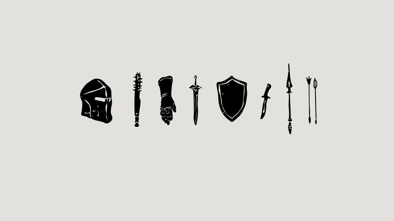
We named it Moat. A moat is the oldest security system we have. Dig deep, fill it with water, and the argument is over before it starts. The name carried the whole promise before anyone read a spec sheet.
The system
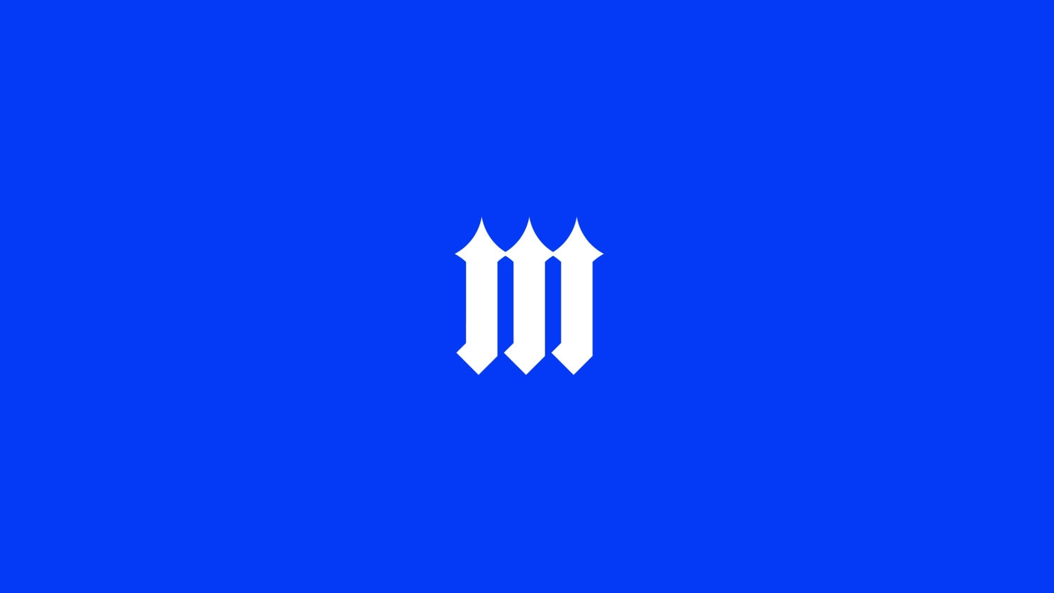
A heraldic mark that holds up at 12 pixels on a phone and six feet on a trade show wall.
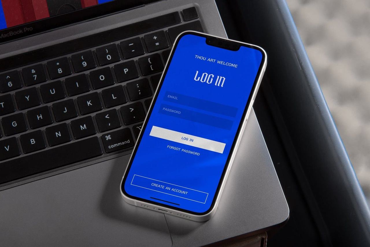
Electric blue, picked to survive retail lighting and still look like security.
Packaging built around texture, so the box feels like the product does.
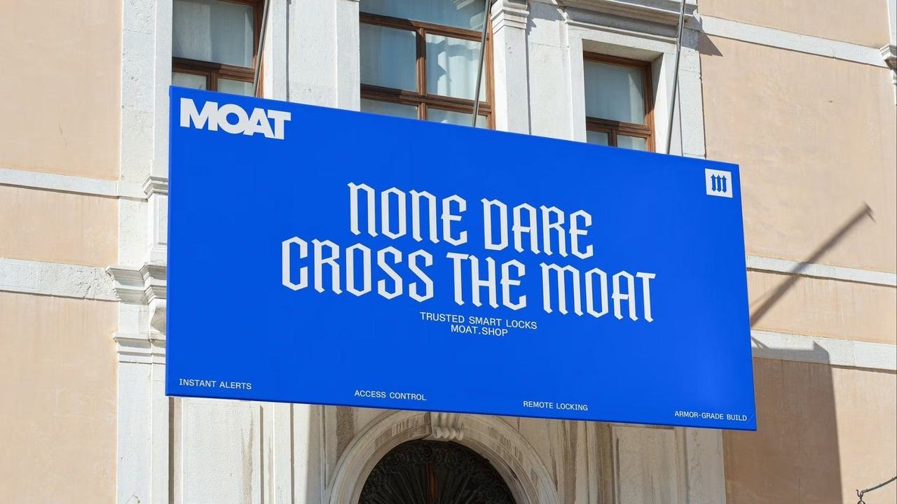
One line that does the selling: None Dare Cross the Moat.
Two audiences, one brand
Consumers buy the story. Facility managers buy the spreadsheet: access logs, battery life, how fast you can kill a key when someone quits. One mark, one voice, two very different sales conversations.
Voice
Low and certain. A moat makes its case by existing, and the copy was written the same way: short sentences, no adjectives doing security's job.
Where it landed
The client walked away with a platform to grow into, gyms first, then schools and multi-building facilities, and a name that no longer needed explaining.
Client: Confidential
Sector: Smart security, consumer tech, B2B